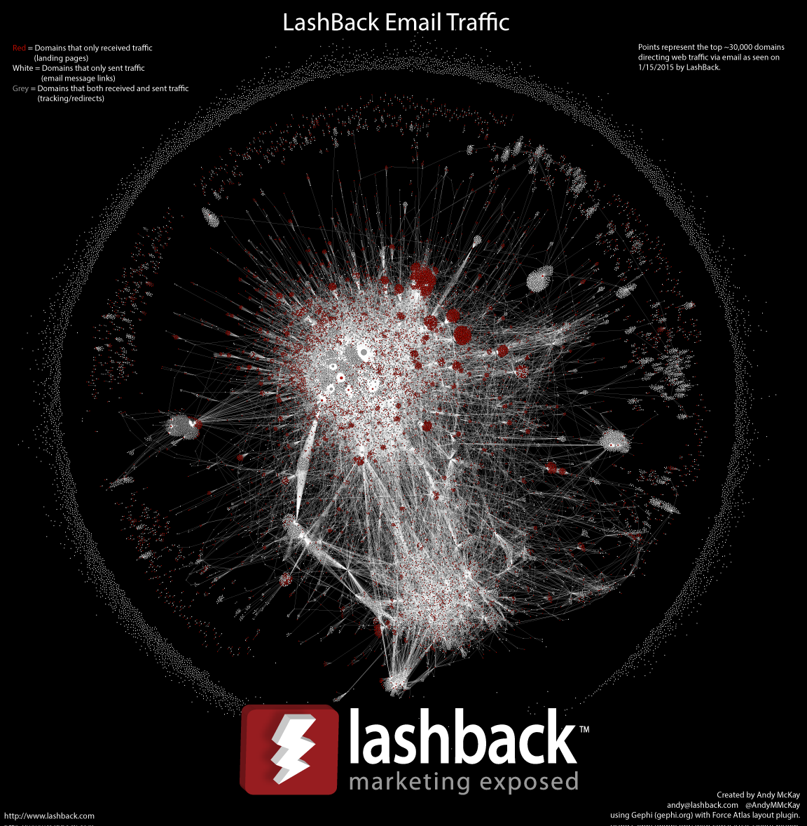
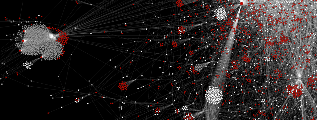
This visualization, created using Gephi 0.8.2-beta, represents the flow of email-originated web traffic through the top 30,000 domains as seen by LashBack on 1/15/2015. Each point is a domain–red points represent domains that only received traffic (landing pages), grey points represent domains that both received and sent traffic (redirection) and white points represent domains that only sent traffic (email message links).
A [much] larger version is available here.
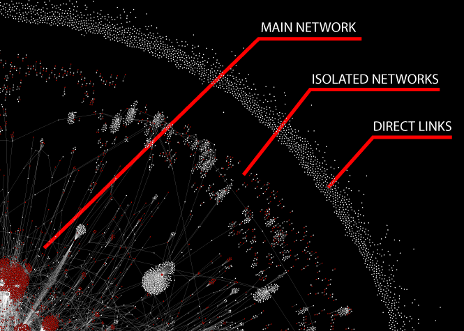
The outlying points in the large, outermost ring represent domains that are either direct links or redirected traffic only to themselves. The small groups of points in the smaller inner ring are isolated networks. These isolated networks [for the most part] redirected traffic to domains that were not connected to the main network in the center of the image.
If you are curious as to where your domain is in the image feel free to contact me (andy@lashback.com) and I’ll do my best to send you a custom rendering. Stay tuned for a deep-dive into insights provided by this image as well as additional visualizations.
LashBack provides compliance, brand monitoring, and competitive intelligence email marketing tools. If you have any questions about LashBack or to get a demonstration of the services that we can provide, please contact us at sales@lashback.com or click here to request a demo.
A larger (~10MB) version of this visualization is available here.
Follow Andy McKay on Twitter: @AndyMMcKay